How To Choose The Best Color For Your Office To Improve Productivity
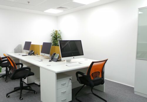
Choosing the perfect paint color is crucial whether you want to freshen up the ambiance in existing serviced offices or are putting the finishing touches on brand-new or furnished office spaces. When maximizing the utilization of the space, the color might be helpful. A 2012 study discovered, among other things, that people perceive a white workspace as cold and uninteresting. According to a study, red can make people perform more quickly and forcefully. This use of color in the workplace is supported by a ground-breaking University of Texas research that found that color can cause a brain reaction that can impact employees’ emotions and general productivity. Studying how color affects productivity is quite needed to decide the colors to use for your furnished office spaces.
It’s simple to choose a paint color for your house. You pick an option that fits your style and is workable. The hue of a workplace designated for work might impact your effectiveness. In this article, you’ll learn color psychology, how office color affects productivity, and how to leverage it to choose the best office space color.
How Office Color Affects Productivity – The Psychology of Colors
When used effectively, color may impact how you feel and see the world around you. You undoubtedly feel a little depressed at the notion of spending the entire day in dull, gray serviced offices; this is the brain’s reaction to color combined with the psychological effects and connections of one’s environment. Other colors can have relaxing or invigorating effects or even increase productivity when utilized appropriately in serviced offices or shared office spaces.
Various guiding concepts make up this field of study, which has long been explored in various fields:
- Each hue conjures up a distinct set of thoughts or feelings.
- Both acquired and biologically intrinsic meanings exist.
- Color-motivated behavior results from the assessment that is triggered by color perception.
- Colors might unconsciously and instinctively influence a person.
- How a person perceives color may be significantly influenced by context.
- Even our physical health is impacted by color psychology. Specific colors have been shown to raise blood pressure and speed up metabolism.
The psychology of color in workplace design is significant, especially in light of how office color affects productivity and mental health. Our brains react differently to various hues, both positively and negatively.
Things to Consider While Selecting The Ideal Paint Colors For Your Workspace
Selecting shared office spaces wall paint is difficult. It is challenging to decide which color or colors work best in your setting because so many options are available. The work becomes considerably less complicated when you keep a few rules for picking the appropriate tones for your serviced offices.
Verify The Quantity of Natural Light in The Area
The light will considerably influence your choice of paint color. Darker tones work better in spaces with lots of natural light than in spaces with little to no natural light. It’s also crucial to consider how different colors will seem under other lighting conditions.
The Size of Your Workspace or Shared Office Space Will Help You Choose The Right Colors
Open up a small room with softer colors if you have one. Use darker hues to create a more personal atmosphere in large furnished office spaces. Darker colors may also make any space cozier.
Find Professional Painting Advice
It can be easy to select the ideal paint color for your home, office, or professional workspace. Inquire of the professionals for advice if you’re unsure of the most productive workplace colors for your setting. They are trained to know the right color to use for modern offices, minimalist offices, industrial offices, futuristic offices, vintage offices, and many more.
Some Colors And What They Represent
In this session, you will learn about different colors (either warm or cold), how they impact and influence the office’s ambiance and employees’ moods, and spice up any office space style either serviced, shared, or furnished office spaces.
Blue
The color most closely related to mental stimulation and fostering an environment where workers may be more productive is blue. The most popular color in the world, blue is tranquil and encourages thought, creativity, and performance. Unexpectedly, it also benefits our health; it has been shown to reduce people’s heart rates, respiration rates, and blood pressure.
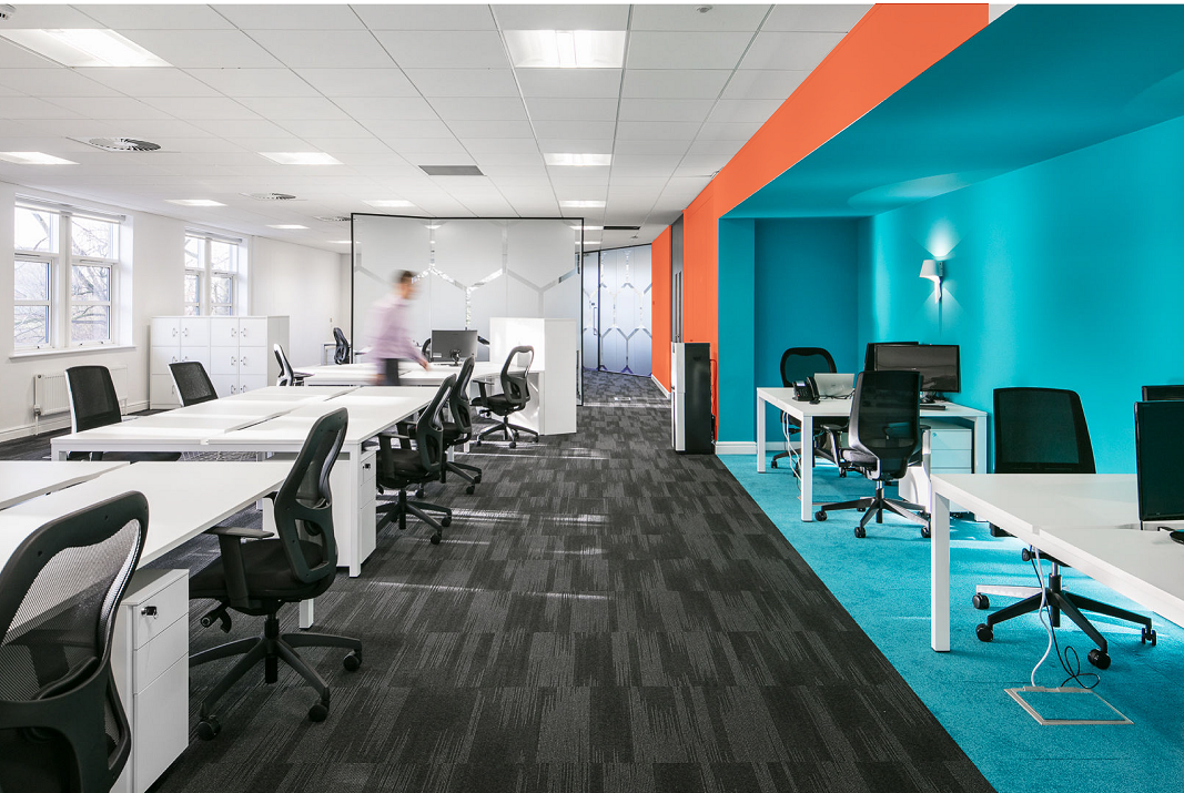
Blue is a fantastic color to utilize as a large-scale background for serviced office space design and as the primary color scheme since psychologists and designers realize that it is regarded as non-threatening while inspiring confidence.
Although blue is supposed to have a mental effect on humans, it may also induce bodily sensations of peace, tranquility, and relaxation. Color in the blue family is a good choice if your business relies on its staff to remain focused, stress-free, and competitive.
Green
Green is another hue recognized for its calming effects. But this color is also related to establishing equilibrium and confidence. Green is “pleasant on the eyes” partly because of the natural balance seen in its leaves, grasses, shrubs, and other plant life, which is only natural. The financial sector is aware that the color green also represents growth. Fortunately, several shades of green may be utilized throughout a wide range of sectors.
Red
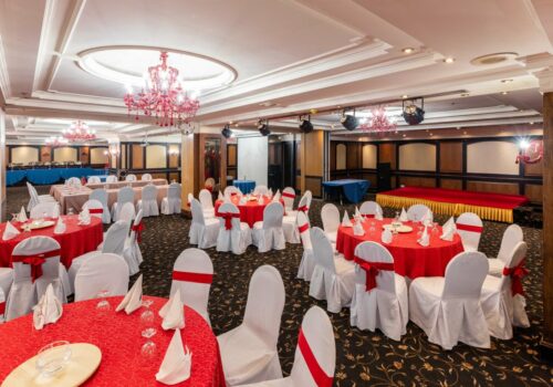
Red is a warm color that works best in environments with plenty of physical activity. On the other hand, too much red might have the opposite effect and give certain workers headaches. Red is utilized for emergency vehicles like fire engines and ambulances because the color may convey a feeling of urgency. It is linked to various emotions, including rage, vigor, power, and tenacity. It is known to increase metabolism, heart rate, and blood pressure.
Purple
Purple is commonly used in settings where energy and productivity are valued because it combines feelings associated with red and blue. As a matter of fact, purple dye was once only available through the costly and unusual process of extracting the color from snails. As a result, it rose to become the hue of monarchy and has remained associated with wealth, power, and riches. Use purple paints in various shades to give your interiors a sense of luxury.
Conclusion
In terms of workplace design, color is essential. A sterile workplace can hinder productivity and hurt everyone’s happiness and wellness. You shouldn’t choose a color just because you like it. Instead, consider the atmosphere you want to foster at your workplace, which may be a shared office space. Feel free to select a distinct hue for the office paint for each part of the serviced offices.
